How to Embrace The Butter Yellow Trend in Your Canadian Home
Your guide to styling the popular trend: window treatments, colour pairings, and more.
Interior design trends come and go, but every so often, one shows up that feels like a breath of fresh air. Enter butter yellow: a soft, warm, creamy hue that has taken the design world by storm. Unlike its brighter, bolder cousins (think sunflower or lemon), butter yellow is subtle, versatile, and surprisingly sophisticated. It brings warmth and cheer to a space without overwhelming it, making it an ideal choice for anyone looking to freshen up their interiors with colour that still feels calm and collected.
In this post, we'll dive into the butter yellow trend and explore how to incorporate it into your home, with a special spotlight on one of the most overlooked areas in design updates: window treatments.
Why Butter Yellow?
Butter yellow sits in that sweet spot between neutral and colour. It's not loud or garish, but it's also not so muted that it fades into the background. This colour exudes a sense of optimism, warmth, and comfort—exactly what many of us crave in our living spaces. It pairs beautifully with a range of tones, from earthy neutrals to deeper blues, sage greens, and even soft lilacs.
Moreover, butter yellow evokes nostalgia. It has a timeless quality that feels both vintage and modern, perfect for blending old and new elements in your decor. Think of it as the design equivalent of a sunny morning spent sipping coffee by the window, whether you live in Vancouver, Halifax, or somewhere in between.
In Ontario, where weather can be grey and unpredictable for much of the year, butter yellow is especially appealing. It brings a sense of brightness and positivity indoors, making it a popular choice in urban centres like Toronto and Ottawa, as well as in rural cottage country. Whether you're styling a sleek downtown condo or a cozy lakeside retreat, butter yellow works seamlessly with a wide range of interior aesthetics popular in the province.

Incorporating Butter Yellow: The Basics
Before diving into window treatments, let’s look at a few easy ways to bring this shade into your home:
Walls: A butter yellow wall can transform a dark or cold room into a bright, inviting space. It works beautifully in kitchens, dining rooms, or nurseries where you want an uplifting mood.
Furniture: Upholstered chairs, accent couches, or even a painted dresser in this colour can add a cheerful focal point to any room.
Accessories: Throw pillows, rugs, and vases are simple and noncommittal ways to test out the trend.
But if you're not ready to fully commit with paint or large furniture, window treatments are an excellent way to incorporate this trend.
Window Treatments: The Perfect Butter Yellow Canvas
Window treatments offer a wonderful balance between form and function. They affect both the aesthetics and ambiance of a room, and when chosen thoughtfully, they can be a subtle yet impactful way to introduce new colours like butter yellow. Keep reading for several styles and ideas to consider when incorporating the trend into your home:
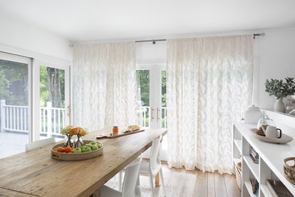
1. Sheer Curtains in Butter Yellow
Light, sheer panels in a buttery yellow hue can instantly brighten a room. When sunlight filters through the fabric, it casts a soft golden glow, creating a cozy, dreamy atmosphere. Sheer curtains work well in bedrooms, living rooms, or any space where you want to maintain lightness and airiness.
Styling Tip: Pair with white or natural linen drapes for a layered, textured look that feels relaxed and effortless. Take the first step and get a feel for these fabrics when ordering free samples.
See and feel the fabric.
2. Roman Shades for a Tailored Touch
Roman shades in butter yellow are perfect for adding structure and elegance without sacrificing colour. Their clean lines and classic appeal suit kitchens, bathrooms, and home offices particularly well.
We recommend going for fabrics with a subtle texture, such as linen or cotton blends, to keep the look sophisticated. You can also opt for patterned shades that incorporate butter yellow with other coordinating tones.
3. Floor-Length Drapes for Drama
If you’re ready to make a bold statement, floor-to-ceiling drapes in a rich butter yellow can add drama and depth to a room. These work beautifully in dining rooms or formal living rooms, especially when paired with complementary wall colours like soft grey, dusty blue, or warm white.
Styling Tip: Use brass or gold curtain rods to enhance the warmth of the yellow and tie in metallic accents around the room.
4. Pattern Play
Butter yellow doesn’t have to stand alone. It pairs beautifully with prints and patterns. Consider floral, geometric, or abstract designs that incorporate butter yellow along with other hues from your palette.
Gingham or toile curtains with a butter yellow background evoke a charming, cottage-inspired aesthetic, while modern patterns can give the colour a fresh twist.

5. Layered Shades and Curtains
Combining butter yellow Roman shades with neutral-toned drapes, or vice versa, allows for flexibility and balance. The yellow serves as a pop of colour while the neutral grounds the space. This approach is especially useful in open-concept homes or spaces with mixed design elements.
Butter Yellow Pairings: Creating Cohesion
When using butter yellow in your window treatments, think about the broader palette of your room. Here are a few colour combinations that work beautifully:
Butter Yellow + Sage Green: A nature-inspired pairing that feels calm and fresh.
Butter Yellow + Dusty Blue: Adds a touch of coastal charm and serenity.
Butter Yellow + Terracotta or Clay: Warm and earthy, this combination brings in rich undertones.
Butter Yellow + Warm White: For a clean, timeless look with plenty of brightness.
In Ontario homes, especially those with smaller urban footprints, these combinations work well to enhance natural light and maximize the feeling of space. Many designers in the province are also pairing butter yellow with natural wood finishes and locally made decor items for a warm, curated look.
Accent your window treatments with coordinating decor—a vase, an art print, or throw blanket—to tie the room together without going overboard. Need additional styling advice? Let our expert design consultants bring samples, guidance, and inspiration to your doorstep.
Don't know where to start?
Final Thoughts: Why You Shouldn't Overlook the Windows
Window treatments are often an afterthought, but they shouldn’t be. They offer one of the most impactful ways to change the feel of a room without major renovations. And when it comes to colour trends like butter yellow, they provide an accessible and flexible entry point.
Whether you're drawn to sheer, dreamy panels or more structured Roman shades, butter yellow brings a sense of sunshine and softness to your space. It’s a reminder that design doesn’t always have to shout to make a statement.
Sign Up & Save $50 OFF
By filling out the above information, I agree to receive promotional emails and other communications from Blinds To Go. I understand I may unsubscribe at any time. Contact us for details or view our Privacy Policy